Columis logo redesigned & identity system
ROLE: Lead Designer
TIMELINE: 2 Weeks - December 2025
SCOPE: Logo Design / Visual Direction
CHANNELS: Website, Socials, Paid, Emails, Blogs
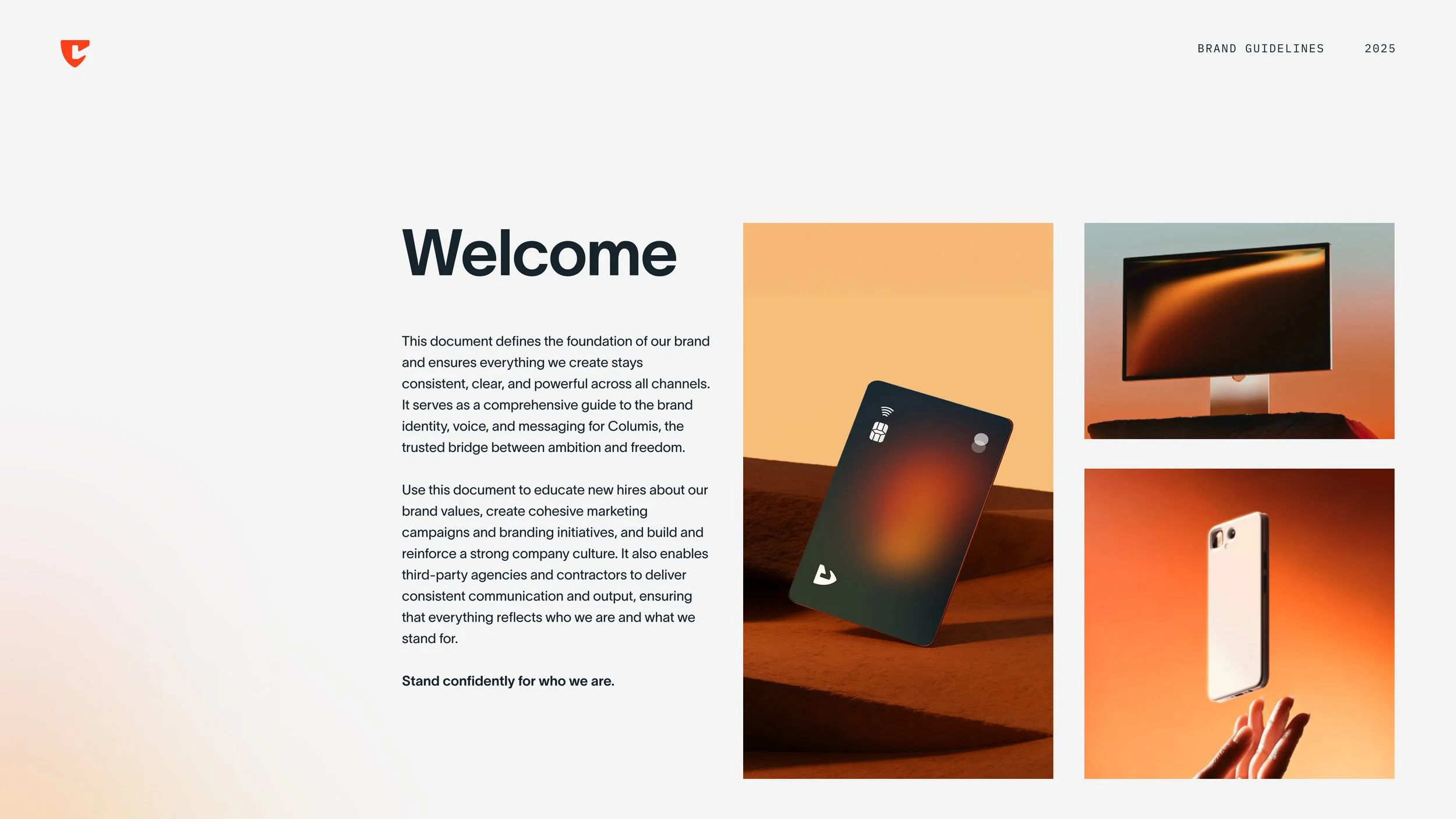
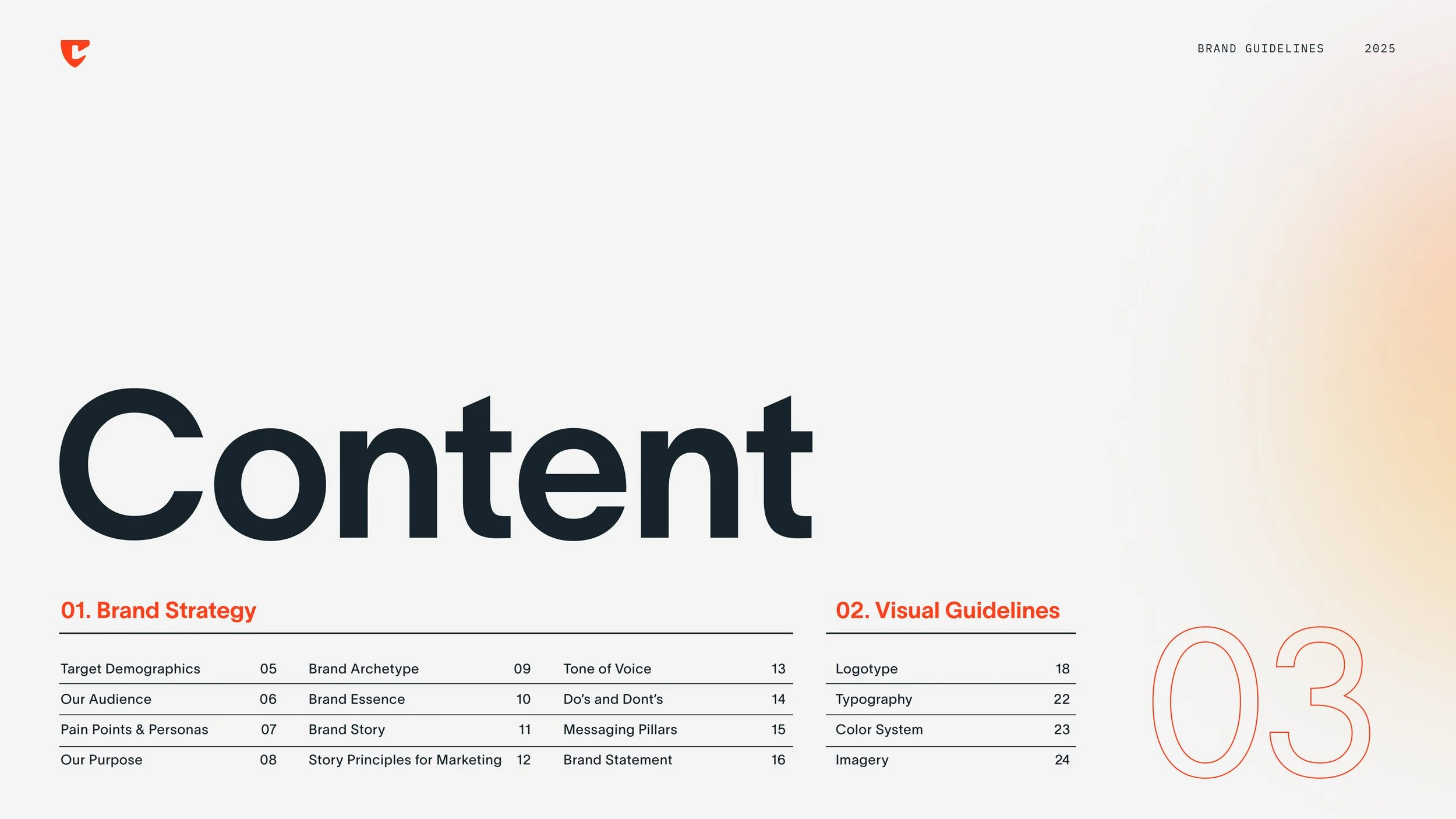
DELIVERABLES: Brand Guidelines
TEAM: PM / Creative Director / UI/UX Designer
-
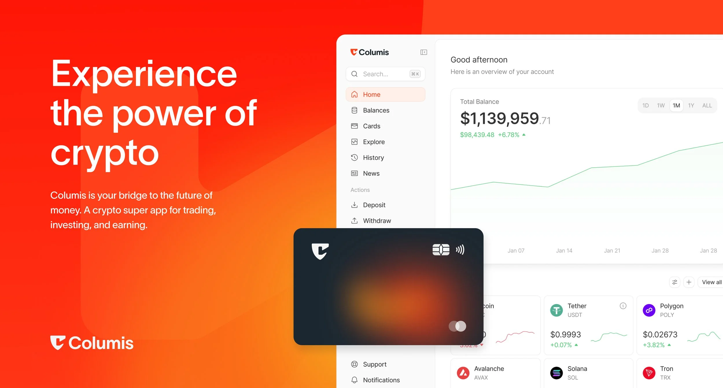
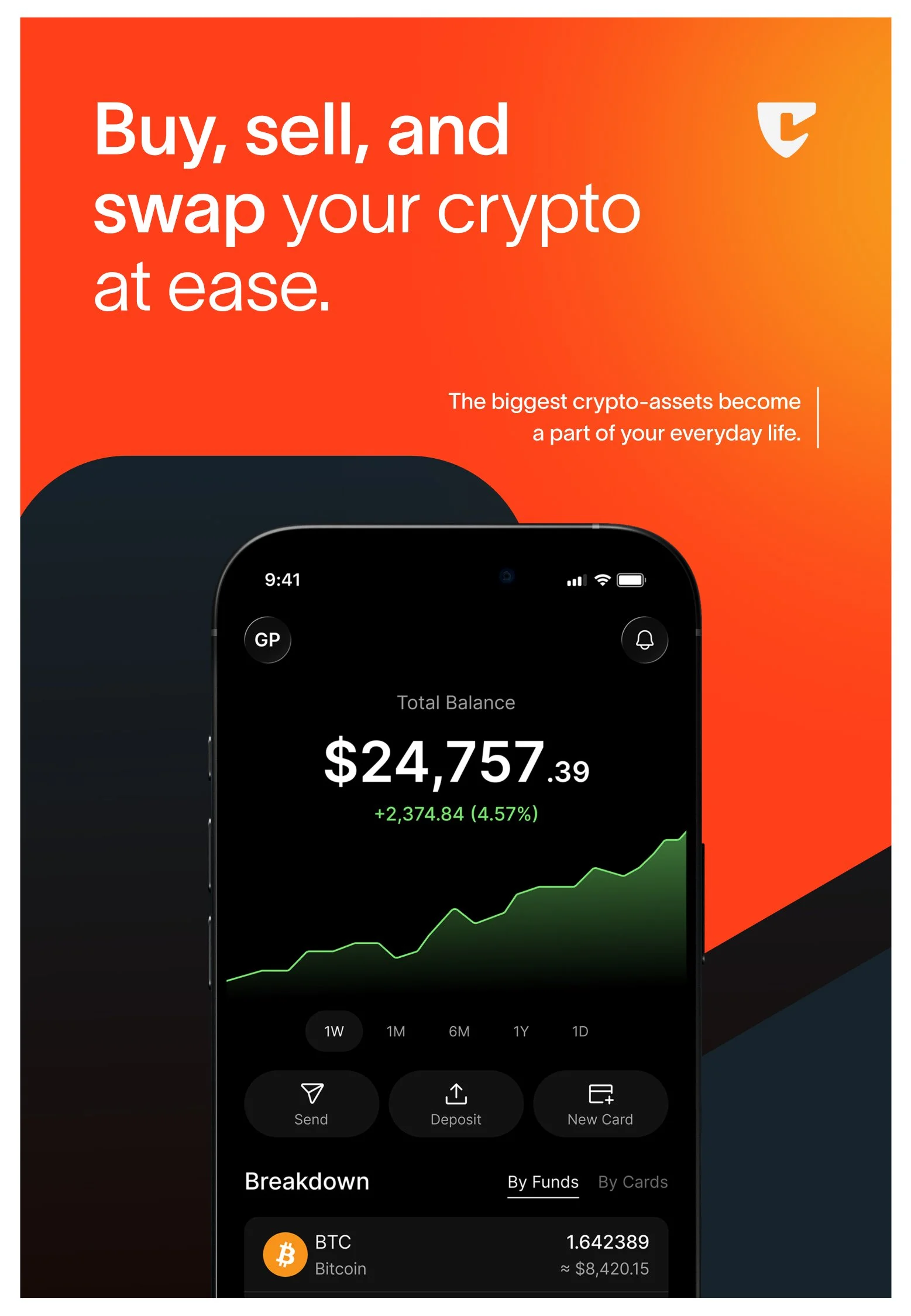
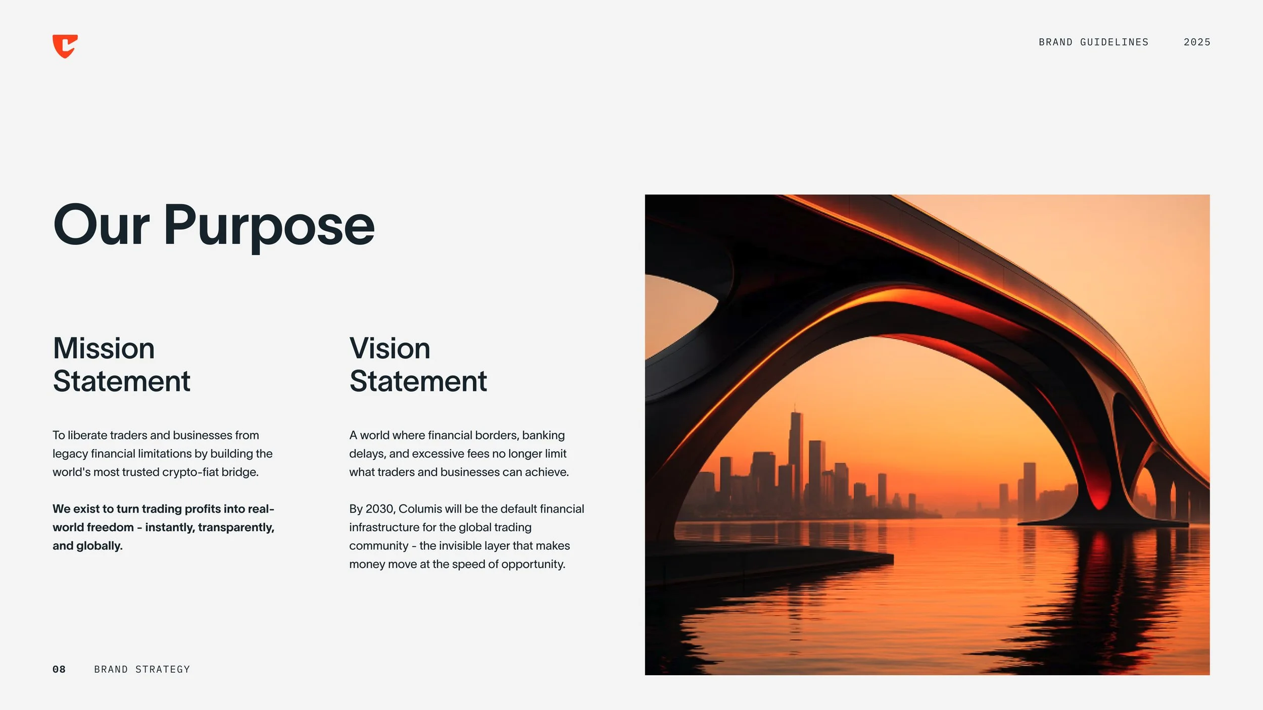
Columis is a financial product focused on helping users move money with more clarity and confidence, built around a secure, low-friction experience.
Columis needed a logo redesign that felt stronger and more distinctive than the existing mark, while clearly signaling security and trust. The goal was to create an identity that could live as a recognizable app icon and a confident logotype across touchpoints.
-
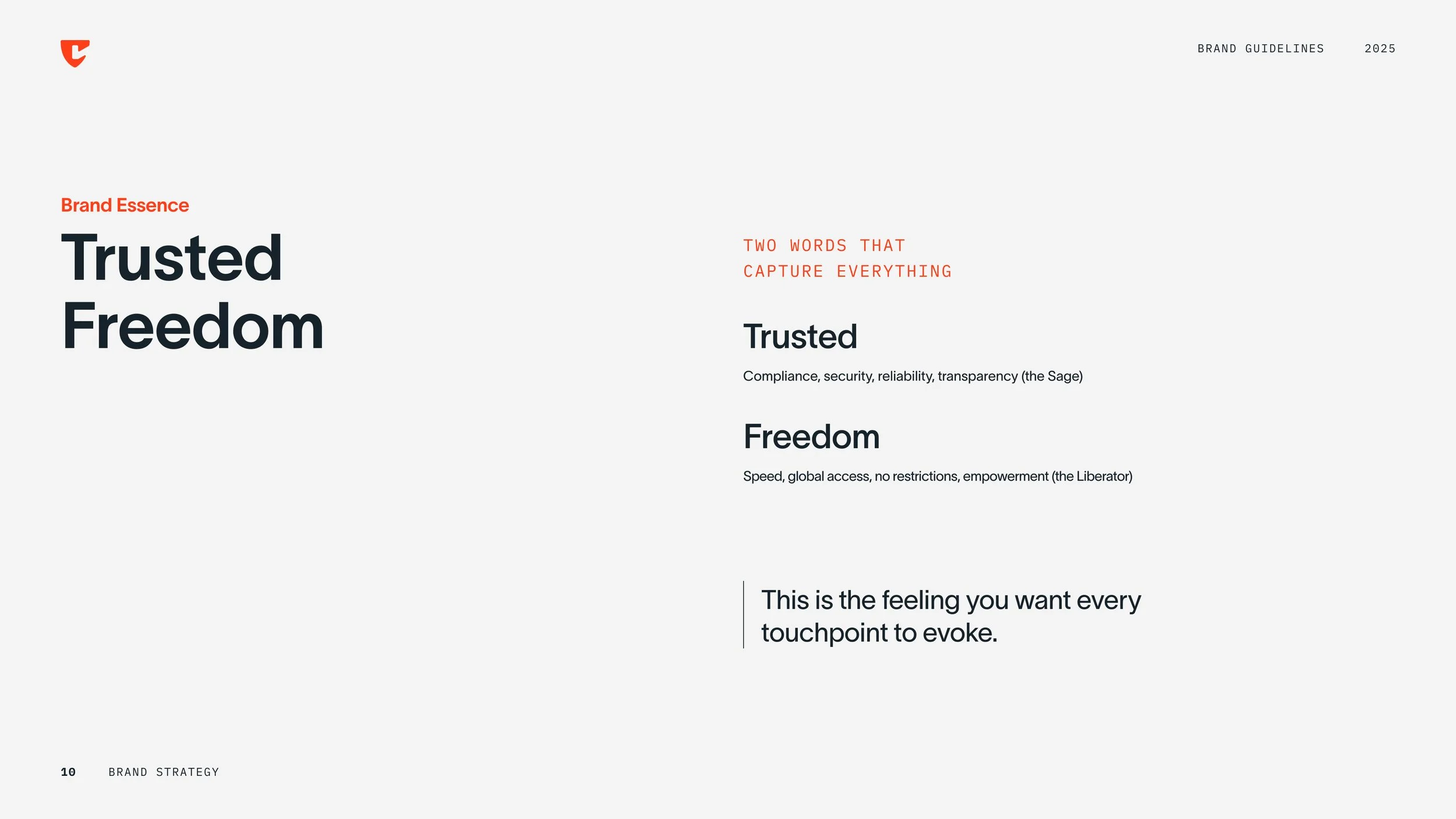
Communicate protection and reliability at a glance.
Design an icon that stays clear at small sizes (app, favicon, UI).
Make it memorable and meaningful, not generic "finance shield" branding.
-
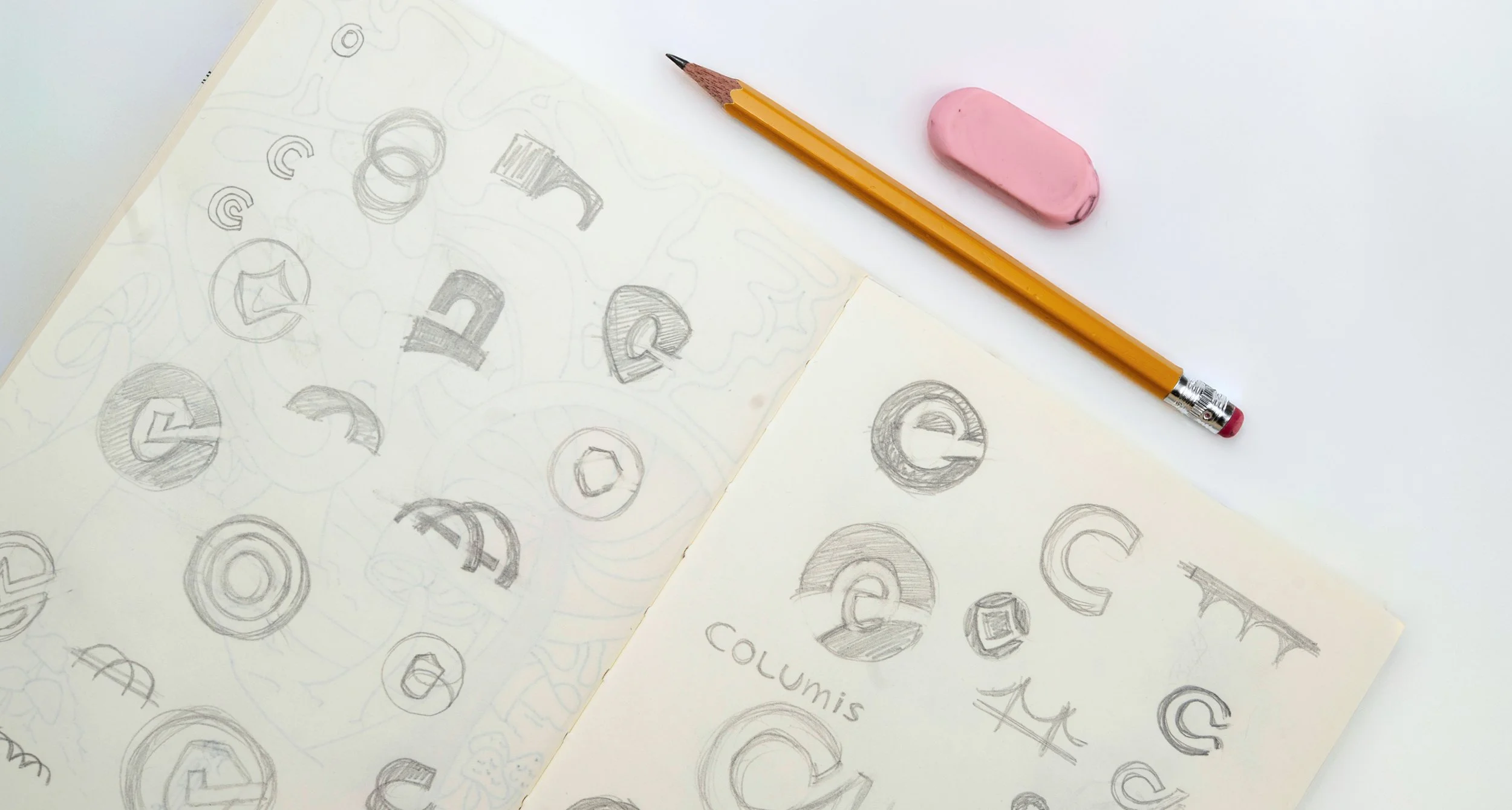
Explored multiple mark directions focused on security-led symbolism.
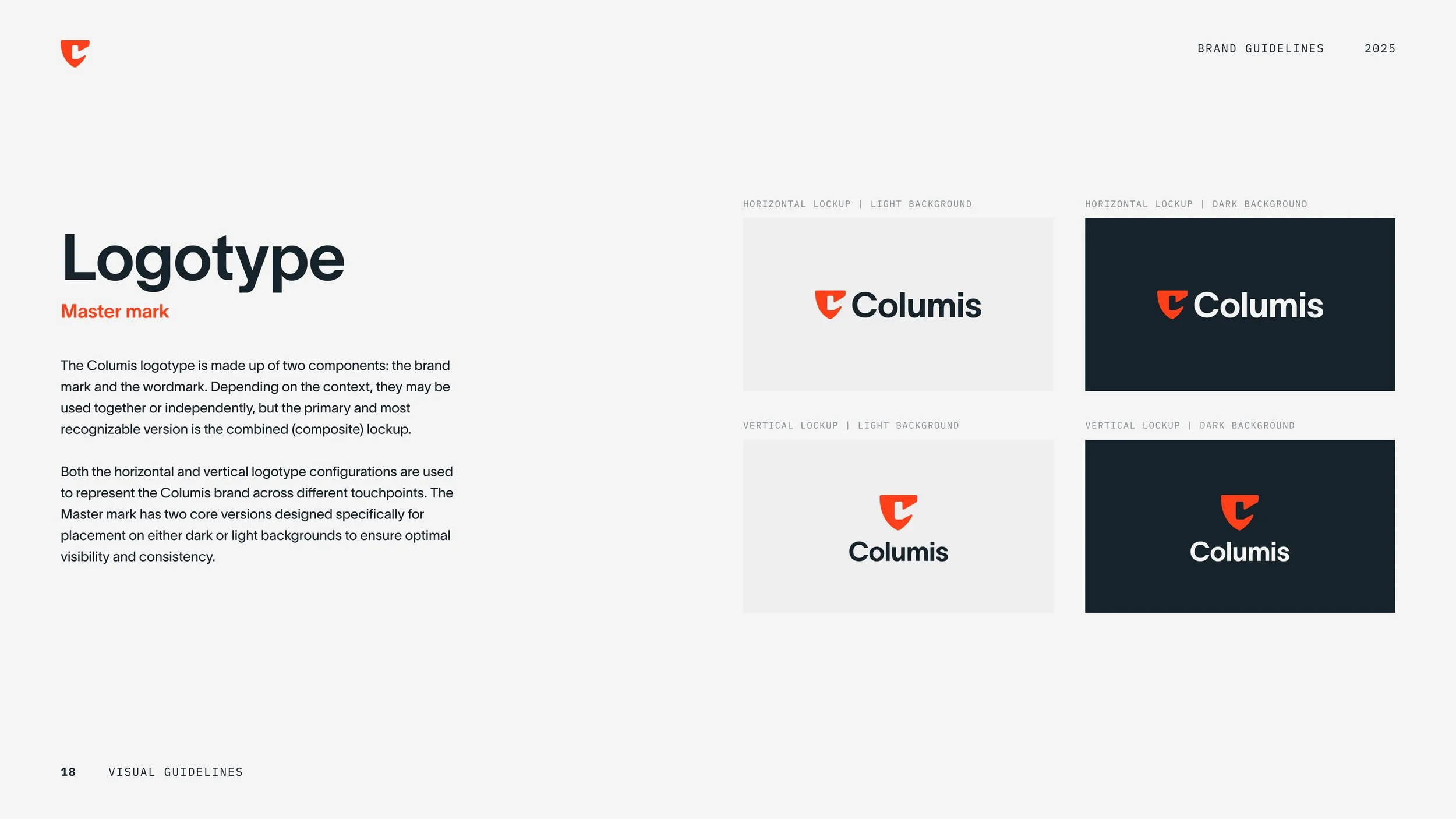
Developed a "Secure Foundation" concept, merging a shield form with a verification cue.
Refined geometry and weight to ensure legibility, balance, and recognition at icon scale.
-
A more distinctive, security-first identity with a clear rationale, built to perform as a standalone app icon and as the foundation for the broader visual direction.
Process and craft
Design sketch exploration: multiple icon directions rooted in security and trust
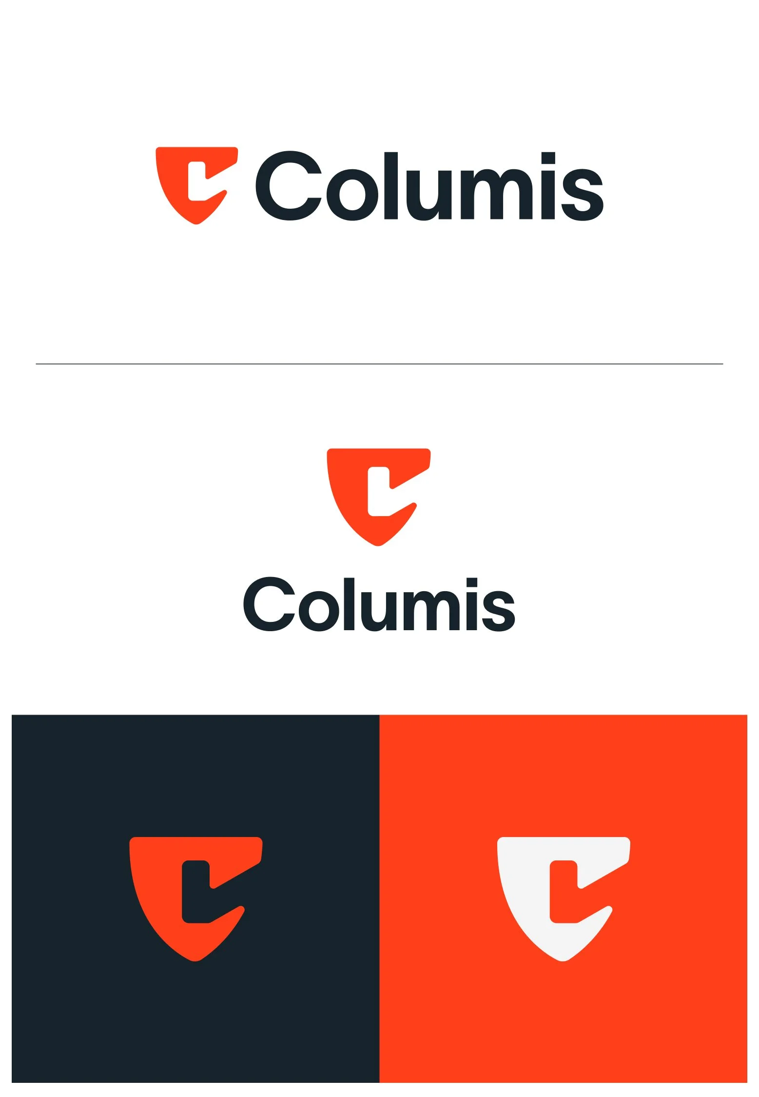
Final mark development: the Secure Foundation concept, shield plus verification cue, with a subtle “C” integrated into the form for stronger brand ownership
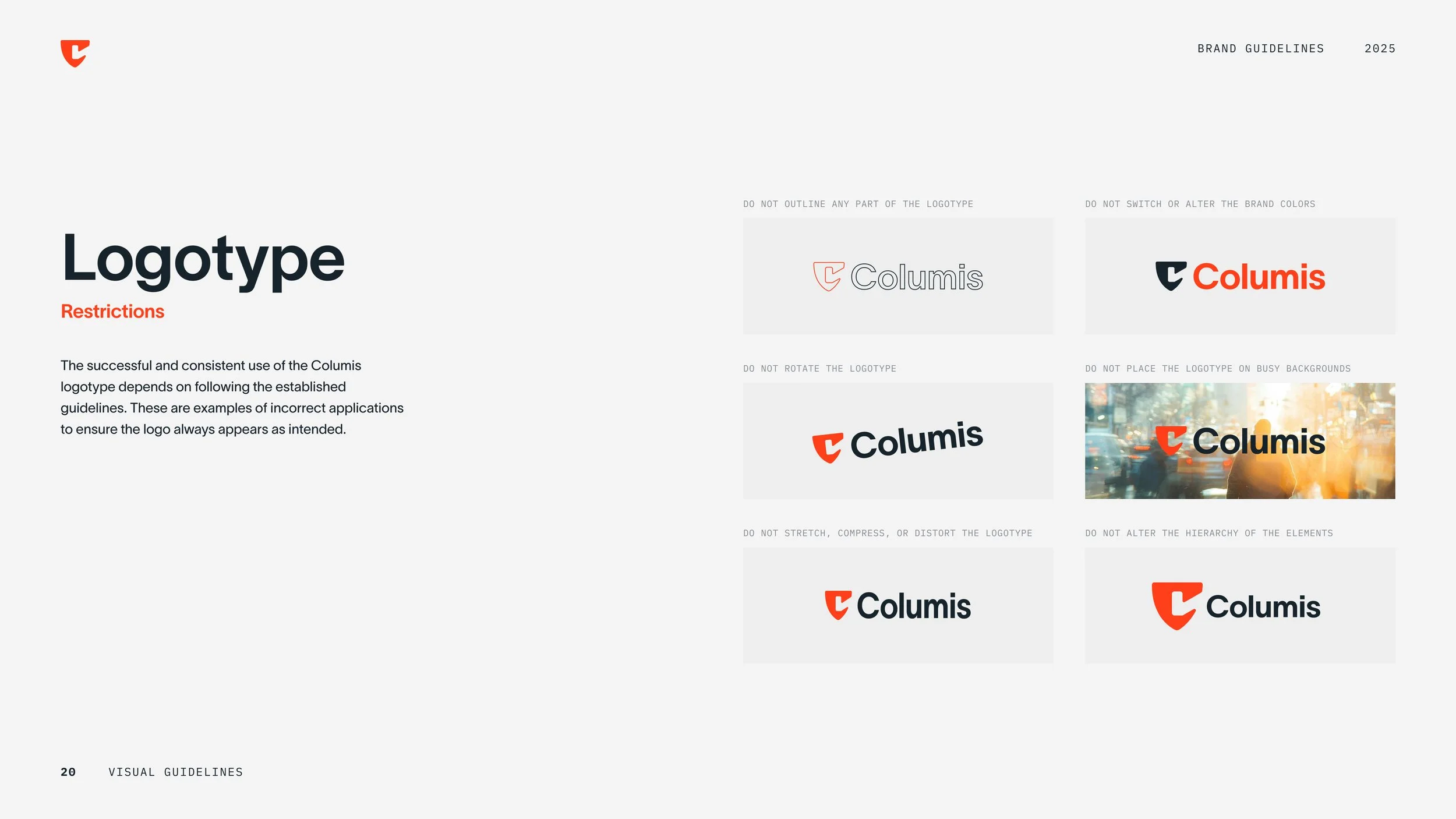
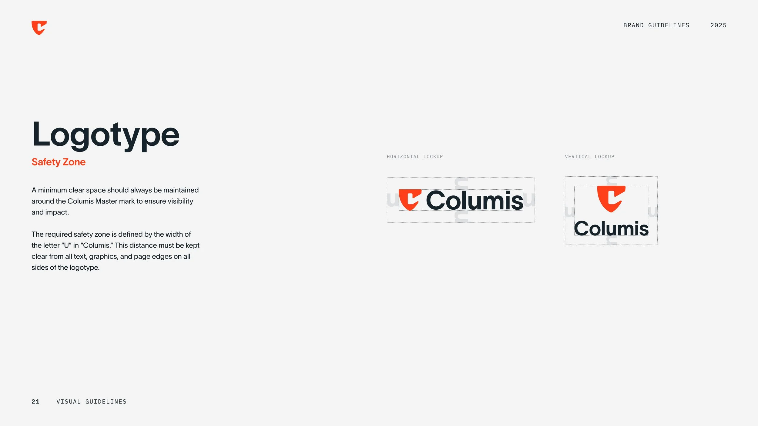
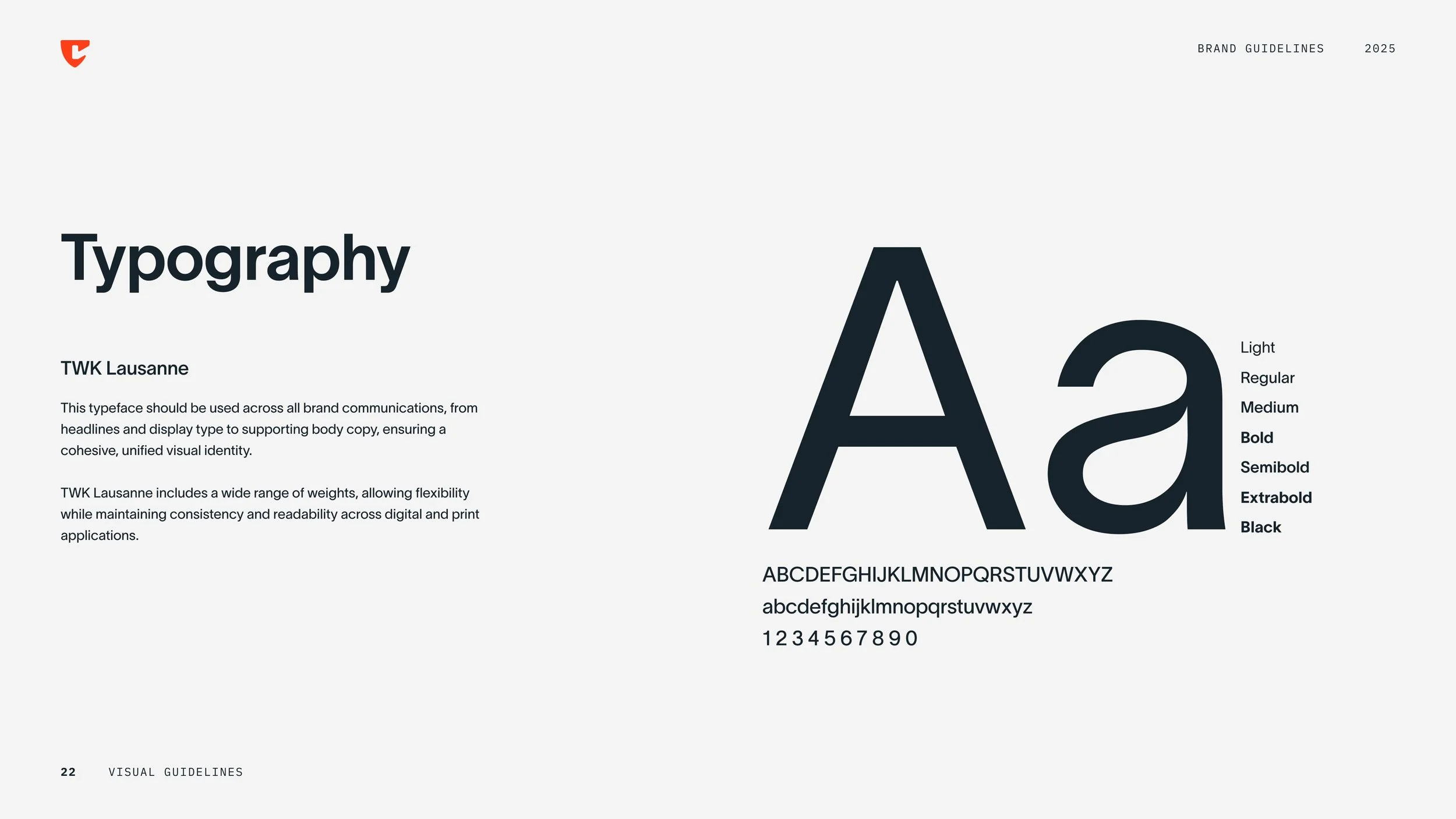
Logo suite and core usage rules
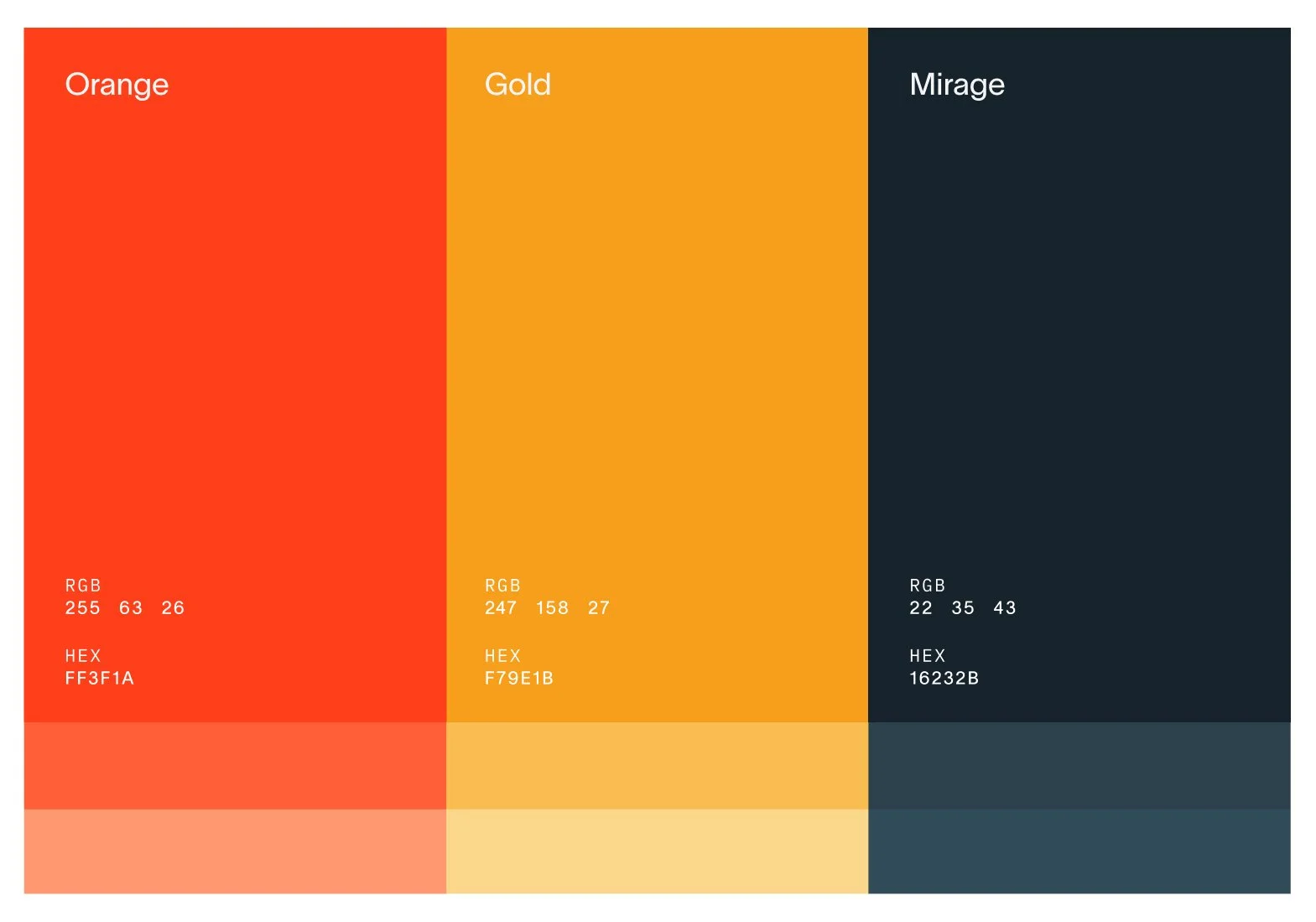

From concept to system
This carousel highlights key pages from the guide, showing how the logo and visual direction translate into clear, repeatable rules. The goal: help any team execute confidently and keep Columis consistent as it grows.
This work was produced at TX3 Funding in my role as Lead Designer. All trademarks and materials belong to Columis and are displayed here solely for portfolio presentation.